Design the Layout
ZK provides various layout components for different layout requirements, and you can even configure a component's attribute to adjust layout details.
Layout Requirement
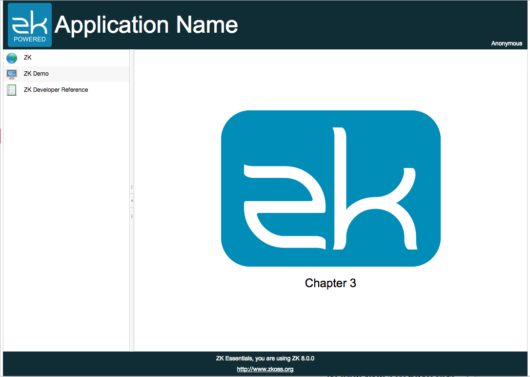
The image above is the target layout we are going to create in this chapter, and this kind of design is very common in web applications. It divides a page into several section:
- The banner at the top contains application icon, title, and user's name at the right most corner.
- The footer at the bottom contains general information.
- The sidebar on the left contains 3 links that direct you to 3 different URLs.
- The central area displays the current function.
ZK provides various layout components, and each of them has different styles. You can use a layout component alone or combine them to build a more complex layout. According to our requirement, Border Layout fits the requirement most since it has 5 areas: north, west, center, east, and south. We can use the north as a banner, west as a sidebar, south as a footer, and the center as the main content.
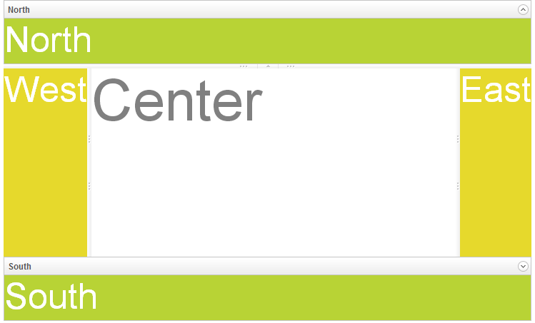
Border Layout