Construct a Form Style Page
With the concept and technique we talked about in the previous chapter, it
should be easy to construct a form style user interface as follows. We
uses a two-column <grid> to build the form style layout and different
input components to receive user's profile like name and birthday. The
zul file below is included in the <center> of <borderlayout>.
We build the frame of this form first:
chapter3/profile-mvc.zul
<?link rel="stylesheet" type="text/css" href="/style.css"?>
<window
    border="normal" hflex="1" vflex="1" contentStyle="overflow:auto">
    <caption src="/imgs/profile.png" sclass="fn-caption"
        label="Profile (MVC)"/>
    <vlayout>
        <grid width="500px">
            ...
        </grid>
        <div>You are editing <label id="nameLabel"/>'s profile.</div>
        <hlayout>
            <button id="saveProfile" label="Save"/>
            <button id="reloadProfile" label="Reload"/>
        </hlayout>
    </vlayout>
</window>
- Line 4, 5:
<caption>can be used to build compound header with an image for a<window>. - Line 6:
<vlayout>is a light-weight layout component which arranges its child components vertically without splitter, align, and pack support. - Line 11:
<hlayout>, like<vlayout>, but arranges its child components horizontally.
A Grid Makes a Form
Then let's put components in a Grid to arrange them as a form style. A <grid> is basically composed by <columns> and <rows>:
<grid>
    <columns>

    </columns>
    <rows>

    </rows>
</grid>
<columns> can have<column>(no 's'), and<rows>can have<row>(no 's').
chapter3/profile-mvc.zul
        <grid width="500px">
            <columns>
                <column align="right" hflex="min"/>
                <column/>
            </columns>
            <rows>
                <row>
                    <cell sclass="row-title">Account :</cell>
                    <cell><label id="account"/></cell>
                </row>
                <row>
                    <cell sclass="row-title">Full Name :</cell>
                    <cell>
                    <textbox id="fullName" width="200px"/>
                    </cell>
                </row>
                <row>
                    <cell sclass="row-title">Email :</cell>
                    <cell>
                    <textbox id="email" width="200px"/>
                    </cell>
                </row>
                <row>
                    <cell sclass="row-title">Birthday :</cell>
                    <cell>
                        <datebox id="birthday" width="200px"/>
                    </cell>
                </row>
                <row>
                    <cell sclass="row-title">Country :</cell>
                    <cell>
                        ...
                    </cell>
                </row>
                <row>
                    <cell sclass="row-title">Bio :</cell>
                    <cell><textbox id="bio" multiline="true"
                        hflex="1" height="200px" />
                    </cell>
                </row>
            </rows>
        </grid>
- Line 3:
hflex="min"can limit the column's width just wider enough to hold each row's content without a line break. - Line 8:
<cell>is used inside<row>,<hbox>, or<vbox>to fully control a column's align, row/column span, and width in an individual row.
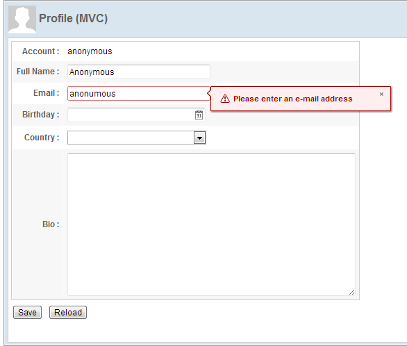
User Input Validation
Each ZK input component provides a built-in input validation by constraint attribute. You can specify a pre-defined constraint rule
to activate it, then the validation works without writing any code in a controller. For example:
    <textbox id="fullName" constraint="no empty: Please enter your full name"
             width="200px"/>
- The constraint rule means "no empty value allowed" for the
<textbox>. If the user input violates this rule, ZK will show the message after a colon.
    <textbox id="email"
             constraint="/.+@.+\.[a-z]+/: Please enter an e-mail address"
             width="200px"/>
- We can also define a constraint rule using a regular expression that describes the email format to limit the value in correct format.
<datebox id="birthday" constraint="no future" width="200px"/>
- The constraint rule means "date in the future is not allowed" and it also restricts the available date to choose.
Then, the input component will show the specified error message when an input value violates a specified constraint rule.