Build the View
Building the view in ZK is basically creating components, and there are two ways to do it:
- ZUML (XML format, declarative) approach.
- Java (programmatic)
We encourage you to build UI with the XML-formatted language called ZK User-Interface Markup Language (ZUML). Each XML element instructs ZK to create a component, and each XML attribute controls the component's function and looking. We will demonstrate this way mainly in our example.
You can even mix these two ways. For example, create a simple page with zul, then add components dynamically in Java within a ZK controller. You can see such usage in the subsequent chapters.
In addition to above ways, richlet allows you to compose the whole page in Java programmatically.
Write a ZUL File
To create components in ZUML, you need to create a file with the file extension ".zul". In zul files, an XML element(tag) represent one component, and you can configure each component's style, behavior, and function by setting the element's attributes. Please refer to ZK Component Reference and Javadoc for complete component attributes.
A very simple, classic zul example is like:
<zk>
<label value="hello 
world"/>
</zk>
The tag <label> will create a Label component at the server and display "hello world" in one line in your browser. It's one line because it ignores special characters like a new line (
) by default.
But we can specify pre attribute to preserve new line character, so that it will display "hello world" in 2 lines.
<zk>
<label pre="true" value="hello 
world"/>
</zk>
Therefore, one ZK component can provide various functions with different attributes.
Tools for IDE
Eclipse
If you use Eclipse, we encourage you to install our Eclipse plugin, ZK Studio. Its "content assist" can save you from memorizing component name and attributes. The "word completion" can avoid typos.
IntelliJ IDEA
If you prefer IntelliJ IDEA as I do, we also develop a ZK plugin, it supports content assist, word completion, and data binding syntax assist, too.
Build Application Layout
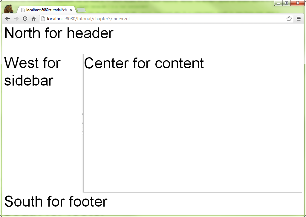
Now, let's built our example application's main layout. create a new text file with name index.zul, and type the following content:
Extracted from chapter1/index.zul
<zk>
    <borderlayout hflex="1" vflex="1">
        <north height="100px" border="none" >
            <label style="font-size:50px">North for header</label>
        </north>
        <west width="260px" border="none" collapsible="true"
              splittable="true" minsize="300">
            <label style="font-size:50px">West for sidebar</label>
        </west>
        <center id="mainContent" autoscroll="true">
            <label style="font-size:50px">Center for content</label>
        </center>
        <south height="50px" border="none">
            <label style="font-size:50px">South for footer</label>
        </south>
    </borderlayout>
</zk>
- Line 2: Each XML tag represents one component, and the tag name is
equal to the component name. The attribute "hflex" and
"vflex"
controls the horizontal and vertical size flexibility of a
component. We set them to "1" which means Fit-the-Rest
flexibility. Hence, the
<borderlayout>will stretch itself to fill all available space of whole page in width and height because it is a root component. Only one component is allowed inside<north>in addition to a<caption>. - Line 3:
<north>* is a child component that can only be put inside a<borderlayout>. You can also fix a component's height by specifying a pixel value to avoid its height changing due to browser sizes. - Line 6, 7: Setting
collapsibleto true allows you to collapse the<west>area by clicking an arrow button. Settingsplittableto true allows you to adjust the width of<west>* andminsizelimits the minimal size of width you can adjust. - Line 10: Setting
autoscrollto true will decorate the<center>with a scroll bar when<center>contains lots of information that exceed the its height. - Line 4,8,11,14: These
<label>s are just for identifyingborderlayout's areas and we will remove them in the final result.
Then, you can view the result from your browser as below:
Construct User Interface with Components
Now we have a skeleton of the application, the next we need to do is to fill each area with components. We will create a separate zul file for each area and then combine them together.
chapter1/main.zul
            <vbox vflex="1" hflex="1" align="center"
                    pack="center" spacing="20px" >
                <image src="/imgs/zklogo2.png" />
                <label value="Chapter 3" sclass="head1"/>
            </vbox>
- Line 1: The
spacingcontrols the space between child components it contains.
In the banner, there's an image with a hyperlink, title, and user name. Let's see how to construct these elements with existing ZK components:
chapter1/banner.zul
<div hflex="1" sclass="banner">
    <hbox hflex="1" align="center">
        <a href="http://www.zkoss.org/">
            <image src="/imgs/zklogo.png" width="90px" />
        </a>
        <div width="400px">
            <label value="Application Name" sclass="banner-head" />
        </div>
        <hbox hflex="1" vflex="1" pack="end" align="end">
            Anonymous
        </hbox>
    </hbox>
</div>
- Line 1: The
sclass, we can specify CSS class selector, and we will talk about it later. - Line 2: The Hbox
which is a layout component can arrange its child components in a
row horizontally. Its
alignattribute controls the vertical alignment. - Line 3: The
Acreates a hyperlink the same as an HTML<a>element. - Line 4: The image
is similar to HTML
<img>which can display an image. - Line 9: The
packcontrols the horizontal alignment. We specifyendon bothpackandalignto make the text "Anonymous" display at the bottom right corner. - Line 10: Here we still don't implement authentication yet, so we use static user name "Anonymous" here.
For the sidebar, we want to arrange navigation items one by one vertically. There are more than one way to achieve this. Here, we use a Grid which is suitable for arranging child components in a matrix layout.
chapter1/sidebar.zul
<grid hflex="1" vflex="1" sclass="sidebar">
    <columns>
        <column width="36px"/>
        <column/>
    </columns>
    <rows>
        <row>
            <image src="/imgs/site.png"/>
            <a href="http://www.zkoss.org/">ZK</a>
        </row>
        <row>
            <image src="/imgs/demo.png"/>
            <a href="http://www.zkoss.org/zkdemo">ZK Demo</a>
        </row>
        <row>
            <image src="/imgs/doc.png"/>
            <a href="http://books.zkoss.org/wiki/ZK_Developer's_Reference">
            ZK Developer Reference
            </a>
        </row>
    </rows>
</grid>
- Line 1: Some components like Grid supports limited child components and you should also notice hierarchical relations between child components, e.g. Rows can only contain Row. Please refer to ZK Component Reference/Data for detail.
- Line 3: You can only put Column inside Columns.
- Line 8,9: Since we define two Columns, each Row can have two components, and each one belongs to a column.
We usually put some contact information in the footer and make it aligned to the center.
chapter1/footer.zul
<div hflex="1" vflex="1" sclass="footer">
    <vbox hflex="1" vflex="1" align="center">
        ZK Essentials, you are using ZK ${desktop.webApp.version}
        <a href="http://www.zkoss.org">http://www.zkoss.org</a>
    </vbox>
</div>
- Line 2: The
Vbox, like
Hbox, arranges child components vertically. We specify "center" at
alignto align those texts horizontally in the center. - Line 3: You can use EL
expressions in the tag
element's body or an attribute. There are also many implicit
objects),
and
desktopis one of them. Refer toorg.zkoss.zk.ui.Desktop's Javadoc to find out available properties.
Next, we will combine these separated zul pages into
chapter1/index.zul.