Chapter 3: User Interface and Layout
Design the Layout
Building an application usually starts from building user interface, and building user interface usually starts from designing the layout. ZK provides various components for different layout requirements, and you can even configure a component's attribute to adjust layout details.
Layout Requirement
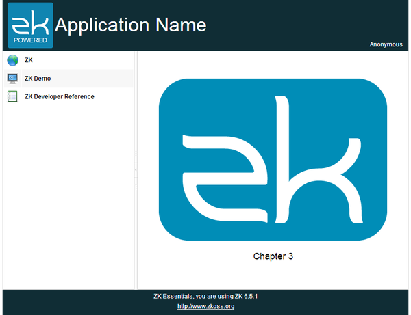
The image above is the target layout we are going to create and this kind of design is very common in web applications. The header at the top contains application icon, title, and user's name at the right most corner. The footer at the bottom contains general information. The sidebar on the left contains 3 links that redirect you to 3 different URLs. The central area displays the current function.
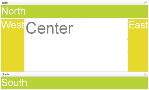
ZK provides various layout components [1], and each of them has different styles. You can use a layout component alone or combine them together to build more complex layout. According the requirement mentioned, Border Layout[2] fits our requirement most since it has 5 areas: north, west, center, east, and south. We can use north as header, west as sidebar, south as footer, and center as main function display.
Write a ZUL
To create a component in ZK, we need to use a XML-format language named ZUL and all files written in ZUL should have the file extension ".zul". First, Create a new text file with name index.zul, and type the following content:
Extracted from chapter3/index.zul
<zk>
	<borderlayout hflex="1" vflex="1">
		<north height="100px" border="none" >

		</north>
		<west width="260px" border="none" collapsible="true" splittable="true" minsize="300">

		</west>
		<center id="mainContent" autoscroll="true">

		</center>
		<south height="50px" border="none">

		</south>
	</borderlayout>
</zk>
- Line 2: Each XML tag represents one component, and the tag name equals the component name. The attribute "hflex" and "vflex" controls the horizontal and vertical size flexibility of a component. We set them to "1" which means Fit-the-Rest" flexibility. Hence, the Board Layout will stretch itself to fill all available space of whole page in width and height because it is a root component.
- Line 3: The North is a child component that can only be put inside a Boarder Layout. You could also fix a component's height by specifying pixel value to avoid its height changing under different resolutions.
- Line 6: Set collapsible to true allows you to hide the West area. Set splittable to true allows to adjust the width of West and minsize limits the minimal size of width you can adjust.
- Line 9: Set autoscroll to true will decorate the Center with scroll bar when Center contains lots of information that exceed the its height.
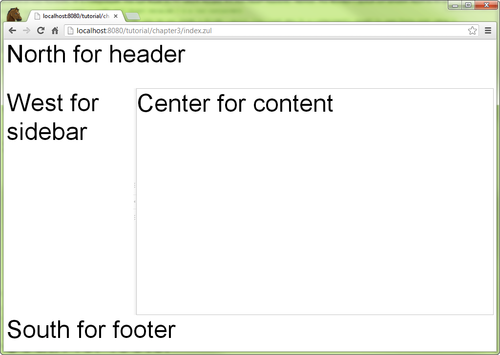
You can view the result from your browser as below:
Apply CSS
In addition to setting a component's attribute, we can also change a component's style by CSS. There are two attributes to apply CSS:
1. style attribute. Like style attribute on HTML element, you can directly write CSS syntax as the attribute's value.
<label value="Chapter 3" style="font-weight: bold;"/>
2. sclass attribute. You should specify a CSS class selector name as the attribute value.
<div sclass="banner">
To use a CSS class selector, you should define it first in a ZUL. There are 2 ways to define a CSS class selector.
1. <style> tag.
<zk>
	<style>
		.banner {
			background-color:#102d35;
			color: white;
			padding: 5px 10px;
		}
	</style>
	...
</zk>
2. <?link ?> directive. It can link to a external style sheet which can apply to many pages.
<?link rel="stylesheet" type="text/css" href="/style.css"?>
<zk>
	...
</zk>
Include a Separate Page
Craft View with Components
Banner
Sidebar
References
- ↑ ZK Demo Layout. Some layout are only available in PE or EE, please refer to Feature & Edition
- ↑ Border Layout Demo


