Component-based UI"
From Documentation
m (Created page with '{{ZKDevelopersReferencePageHeader}} =Version History= Last Update : {{REVISIONYEAR}}/{{REVISIONMONTH}}/{{REVISIONDAY}} {| border='1px' | width="100%" ! Version !! Date !! Conten…') |
|||
| Line 1: | Line 1: | ||
{{ZKDevelopersReferencePageHeader}} | {{ZKDevelopersReferencePageHeader}} | ||
| + | |||
| + | =Overview= | ||
| + | |||
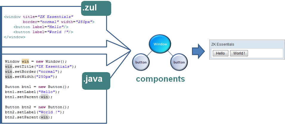
| + | Each UI object is represented with a component (<javadoc type="interface">org.zkoss.zk.ui.Component</javadoc>). Thus, composing UI is all about assembling components. | ||
| + | |||
| + | For example, here we declared a <javadoc>org.zkoss.zul.Window</javadoc> component, enabled the border (border="normal"), and set its width to a definite 250 pixels. Enclosed in the <javadoc>org.zkoss.zul.Window</javadoc> are two <javadoc>org.zkoss.zul.Button</javadoc> components. | ||
| + | |||
| + | [[Image:ZKEssentials_Intro_Hello.png]] | ||
| + | |||
=Version History= | =Version History= | ||
Revision as of 07:50, 3 November 2010
Overview
Each UI object is represented with a component (Component). Thus, composing UI is all about assembling components.
For example, here we declared a Window component, enabled the border (border="normal"), and set its width to a definite 250 pixels. Enclosed in the Window are two Button components.
Version History
Last Update : 2010/11/3
| Version | Date | Content |
|---|---|---|
